
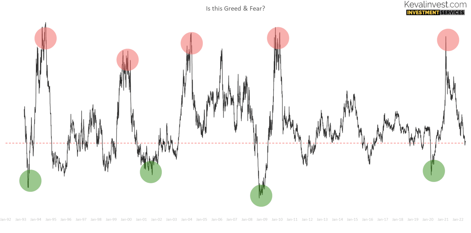
Nifty-50 is the go-to benchmark for equity performance. As a benchmark we will look at its performance over last 31 years. As always greed and fear played an important role in the index journey. The charts below will help to understand this returns over different time frame
Nifty-50 is the go-to benchmark for equity performance. As a benchmark we will look at its performance over last 31 years. As always greed and fear played an important role in the index journey. The charts below will help to understand this returns over different time frame
Intro
Historically, equity markets have always moved in upward direction. Because of this upwards direction, that equity market attracts more investors. With more and more investors wanting to make money, that’s when we see cycles forming.
The cycles are of excess and deficits. The excess cycles start with markets going up (after poor show) on fundamental or positive news. This leads to some investors coming early. When the uptrend continues for some more time, that’s when more investors follow in.
When markets have reached newer highest some bad news acts as the trigger. And the selling start. This led to deficit-cycle as more and more investors see no hopes for near future and pull their money out.
This is how market cycles take shape.
Below, I have tried to put across data of Nifty-50 and see if we can pick cyclical 🔁 behaviour.
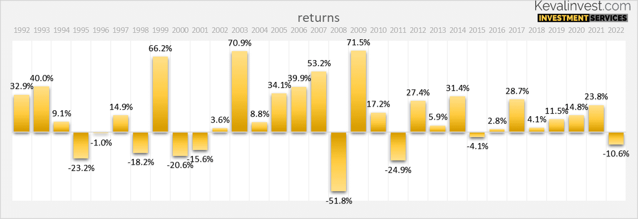
Calendar year returns
Link to historic PE char here
Nifty Rolling Returns
3-Years Rolling Returns
Rolling returns look at performance from point-to-point over the next one or three years. Plotting this date in a series, we get this chart below. You are looking at a 3-year rolling returns chart with a guideline indicating 12% CAGR.
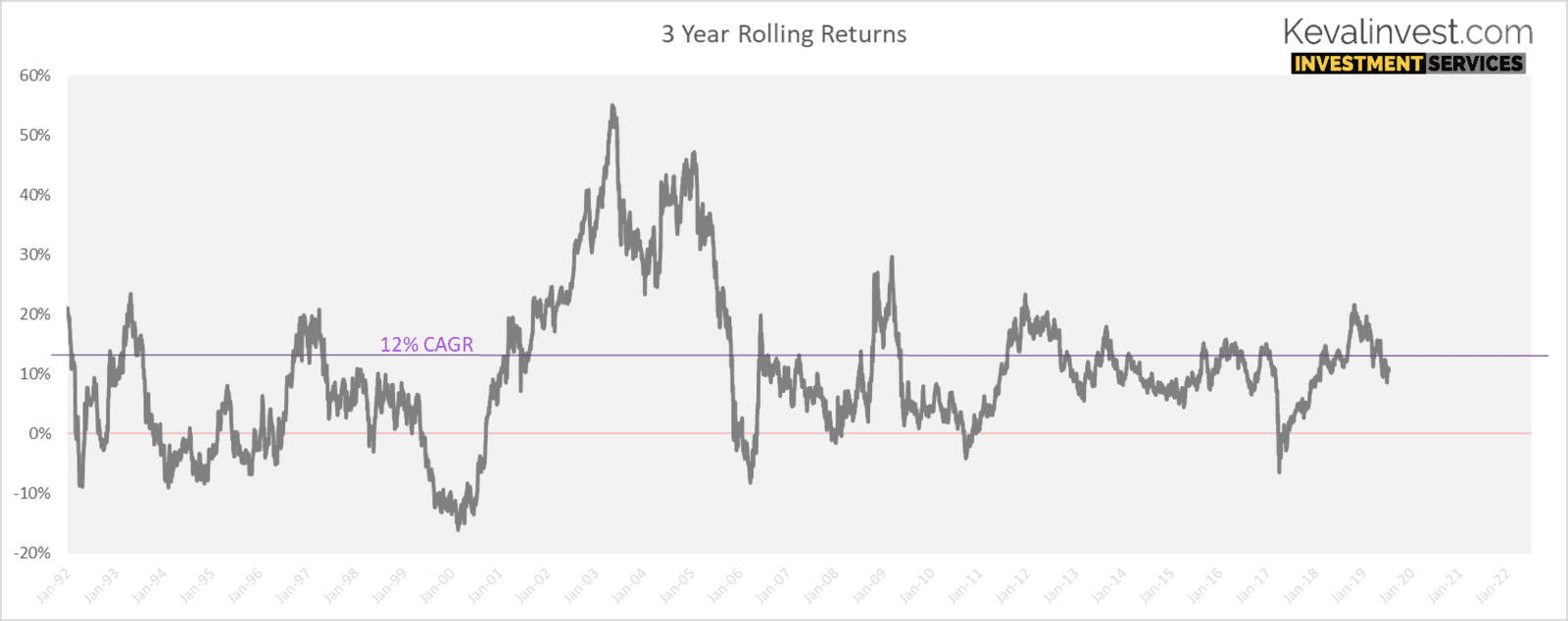
Let me break up the data for you to understand the performance from year 2001. It is logical to make an investment decision based on past performance. In the table below, there are three column table ‘A’ & ‘B’.
'Y' is the column that represents the year in which an investor bought and stayed invested for the next 3 years.
‘A’ is the average returns for last one year.
‘B’ represents the percentage of days in ‘Y’ years that turned out to be well below average or outright negative after 3 year.
For example, markets trade on an average 250 days in a year. Assuming one investor invests on each of the trading day and then holds the investment for the next 3 year. The percentage in column 'B' represents how many of those 250 days turned out to be bad returns after 3 years.
| (Y) Year of investment | (A) Average returns over past 1 years | (B) % of days investors earning below 10% CAGR or negative returns over next 3 years |
| 2001 | -20% | 4% |
| 2002 | -5% | 0% |
| 2003 | 18% | 0% |
| 2004 | 44% | 0% |
| 2005 | 30% | 15% |
| 2006 | 47% | 58% |
| 2007 | 35% | 86% |
| 2008 | -1% | 72% |
| 2009 | 4% | 65% |
| 2010 | 37% | 100% |
2011 to 2020
| (Y) Year | (A) Average returns over past 1 years | (B) % of days investors earning below 10% CAGR or negative returns over next 3 years |
| 2011 | -2% | 45% |
| 2012 | 1% | 5% |
| 2013 | 10% | 44% |
| 2014 | 25% | 70% |
| 2015 | 14% | 69% |
| 2016 | -2% | 23% |
| 2017 | 19% | 83% |
| 2018 | 12% | 11% |
| 2019 | 6% | 4% |
| 2020 | -3% | |
| 2021 | 45% | |
| 2022 | 13% |
Nifty daily returns
Tracking daily returns is not a recommended strategy. But for pure study propose, I made an effort to check if there was any trend we can use. So, let's see what can daily return data has to say. First, the most important data is that Nifty has delivered since 1992 daily returns of around 0.056% average, that's Rs. 0.0565 paisa every trading day., let's call it long term average". But don't let this seemingly tiny number fool you. Extrapolate it over a year, and you get a healthy 14.8% per returns per annum. That is extraordinary high returns, I will take any day.
The chart below simply amplifies the future return expectations. Combine these with fundamentals and I believe one can take an informed decision!
Ill leave it hear now! Will follow up on this with different analysis